This first presentation in on what was called a "technology chronology" or the timeline of events that lead to modern library technological systems. We were given a great deal of leeway in format for this but I defaulted to powerpoint. It was the only program that would properly combine the minimalist style I prefer with the visual impact the professor was looking for. I must confess here that I feel the first slide is the weakest link in this chain of events. I'm not sure if I picked those two events for how truly effective they were or if it was the unconscious byproduct of the fact I've been looking for a venue to discuss Lovelace for a while. Also, I had just recently discovered the vectoring abilities of powerpoint so bear with them. I however managed to snag a decent grade so go me!


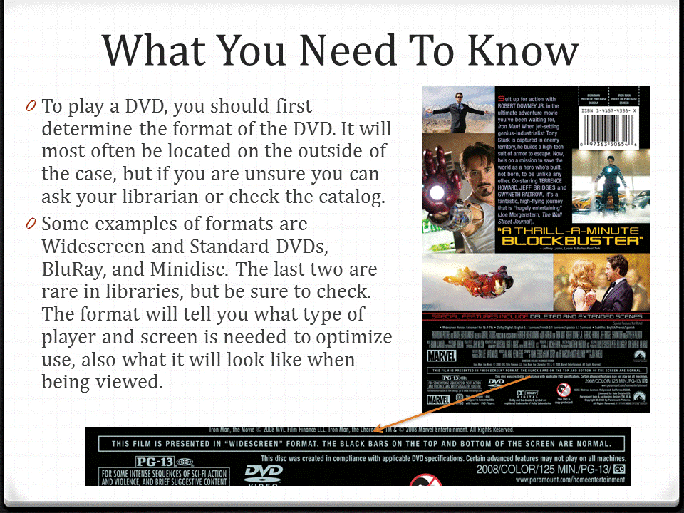
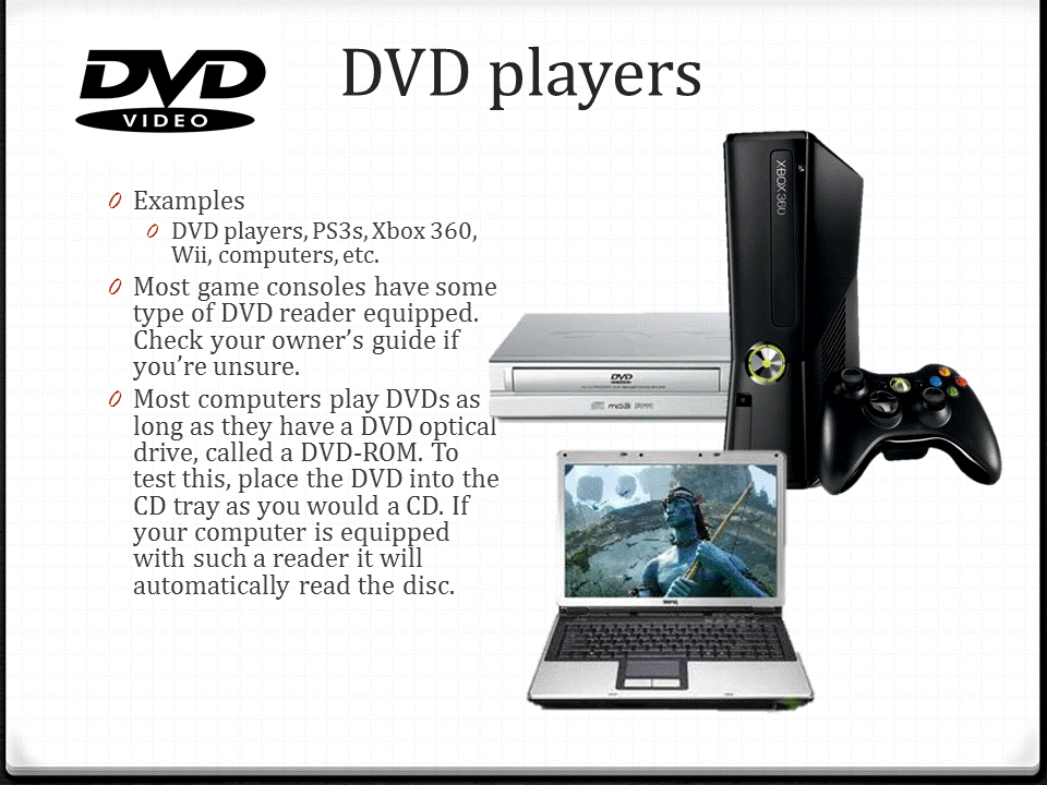
I much prefer this presentation to the first, though that might just be because I think it's more attractive over all. Then there is also the fact that the very instructions told us to simplify a technology to the point of almost idiot-proofing, which was amusing to write. I have to treat rowdy freshmen like proper adults all day at work so it was refreshing to talk at their level for once. As for the directions I wasn't sure if I was supposed to tell them how to use the technology or how the technology works, but I figured that the former was far more practical. You can still see parts of the first incarnation of this presentation when I went with the latter interpretation. I suppose we'll see which one I was supposed to do when I get that grade back. Also, more fun with vectors! I made those CD and DVD security case transparencies myself. I'm quite proud of me.





I'm still unhappy with that last slide. I couldn't think of a visually appealing way to tie it all in really that was more "creative" than my usual work, since that was the major comment on the last powerpoint I did. I had wanted to create a scrolling textbox -- which is to say textbox that rolls like the credits of a movie -- but I want the links to remain accessible and didn't want to bog down the presentation. Maybe next time. Any ideas on how I should improve my work?
